Using Data with Categorical Features
Looking at Categorical Data

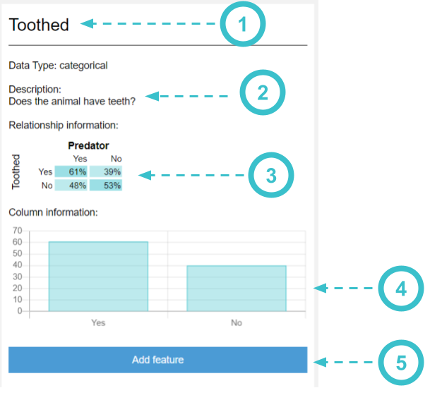
When you click on a column with categorical data, you can view more information in the panel on the right-side of AI Lab
- This is the name of the column that you selected
- This is a description of the column you selected. It can tell you more information about the data in this column. If the data came from a survey, this will usually contain the question that was asked on the survey
- A Cross-Tab chart shows how this column is related to the label you are trying to predict.
- A Bar chart shows how many times a certain value appears in the chart
- Press the "Add feature" button to use this column as one of the inputs in your machine learning model
Reading Cross-Tab Charts
In the Cross Tab chart, look to see if the feature you picked has a strong relationship with your label. The coloring and percentages will help you out - the more that data is clustered around a particular value, the more helpful it will be to AI Bot in making its decision.

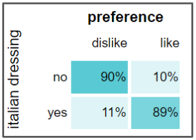
This chart shows a strong relationship between the feature and the label. 90% of the people who said no to Italian dressing also said they disliked their salad, which is a pattern AI Bot can notice. Similarly, 89% of the people who said yes to Italian dressing also said they liked their salad.
This means if AI Bot asks you "Did you have Italian dressing on your salad", it has a strong change of predicting whether or not you liked your salad based on your answer.

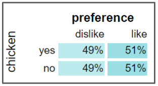
This chart does not show a strong relationship between the feature and the label. The data shows that when people got chicken on their salad, around 50% of them disliked their salad and the other 50% liked their salad. This is basically the same as flipping a coin! This kind of relationship can confuse AI Bot, since none of the answers show a strong connection to each other.
This means if AI Bot asks you "Did you have chicken on your salad", the chances that it also predicts whether or not you like the salad is the same as flipping a coin.
Video
(Opens YouTube in new tab)
Found a bug in the documentation? Let us know at documentation@code.org
