Lesson 6: Creating Summary Tables
Overview
In this lesson students learn how create their own summary tables from raw data. A summary table typically represents one or more aggregations (groupings of items) and computations that are performed on the raw dataset. In most spreadsheet programs, a summary table is called a pivot table. In the lesson, students learn how to make pivot tables in Google Sheets using a provided dataset. Then students turn to the data they’ve collected as a class and, with their partner, use pivot tables to investigate it further.
Purpose
Making a summary (pivot) table is often considered an advanced technique. Once you get used to it, however, it's an extremely powerful computational tool that is available in most spreadsheet software. The purpose here is to acquaint students with using such a tool and to expose this power. Also creating summary tables is a direct tie to the CSP Framework essential knowledge statement: 3.1.3C Summaries of data analyzed computationally can be effective in communicating insight and knowledge gained from digitally represented information.
The other purpose here is that creating a summary table is a good example of making a computational artifact for the Explore Performance Task. For that performance task students might find some raw data while doing research and might create a new artifact that is a summary table of the data that reveals some interesting aspect of it. Using a tool like a spreadsheet to make summary tables let's you explore data in deep ways, quickly and easily.
Being able to manipulate data is an important skill for computer scientists. Being able to create summary tables from larger datasets represents a form of computational thinking. To make a good summary table, one must have a good sense of the data, be able to hypothesize about what might be interesting to look at, and then have the skills to use a computational tool to create it. While seemingly mundane, a spreadsheet is an extremely powerful tool for working with data. Understanding the features of a spreadsheet tool, and what kinds of computations it can perform, can save you a lot of time and energy from either doing such things “by hand” or writing your own program to do it.
Agenda
Getting Started
Activity (90 mins)
Wrap Up
Assessment
View on Code Studio
Objectives
Students will be able to:
- Create a pivot table with at least one aggregation and one calculation when given a set of data.
- Describe the benefits a summary table has over a raw dataset.
- Collaboratively investigate a dataset by creating summary tables.
- Explain the meaning of a summary table they created.
Preparation
- Review Data Tools Resources (including Excel support)
- Familiarize yourself with the tutorials about making pivot tables in Code Studio.
- Ensure sutudents have access to the dataset they cleaned in the previous lesson.
Vocabulary
- Aggregation - a computation in which rows from a data set are grouped together and used to compute a single value of more significant meaning or measurement. Common aggregations include: Average, Count, Sum, Max, Median, etc.
- Pivot Table - in most spreadsheet software it is the name of the tool used to create summary tables.
- Summary Table - a table that shows the results of aggregations performed on data from a larger data set, hence a "summary" of larger data. Spreadsheet software typically calls them "pivot tables".
Teaching Guide
Getting Started
The need to create summary tables of raw data
Teaching Tip
As an alternative, you could show the little summary table above and ask the students:
- How long do you think it would take you to calculate the values in this table from the raw dataset of ~65,000 rows?
Based on what students know so far, they should guess relatively large amounts of time (dozens of minutes, or even hours). You can then reveal that today we’ll learn how to make a table like this in roughly 10 seconds.
Remarks
| Women | Men | |||
|---|---|---|---|---|
| Number | Avg. Rating | Number | Avg Rating | |
| All Movies | 16,716 | 3.54 | 48,819 | 3.53 |
| Star Wars | 102 | 4.23 | 284 | 4.37 |
| Abyss, The | 20 | 4.00 | 82 | 3.55 |
This is an example of a summary table. A lot of work and computation went into this. Notice that this is actually new data that was computed from the raw data. This is way beyond filtering and sorting. Computing this by hand for ~65,000 ratings (or writing formulas in a spreadsheet) would be pretty painstaking.
But we can use computing tools to create summary tables like this for us in a flash. Most data manipulation tools, like spreadsheets, allow you to quickly group, categorize, count, and average things. Making a summary table is a computational technique for exploring the data; let’s try it.
Activity (90 mins)
Transition to Code Studio
Put students back together with their data cleaning partner.
- Students should go through the tutorial individually on their own computer, but should be seated next to their partner.
Teaching Tip
As you circulate the room, keep in mind the key ideas we want students to have:
- Summary tables (pivot tables) provide a way to visualize data
- summary tables allow you to see things in the data you might otherwise not see.
- Summary tables allow you to manipulate and create new data.
- A summary table helps you look at your data in new ways.
- A summary table can be a first step toward a good visualization.
There are 3 levels in Code Studio that students go through.
Look at the levels in Code Studio for full details.
Here is a synopisis of what the students are being asked to do:
Making Pivot Tables Part 1 - The Basics
The first tutorial walks students through the entire process of making simple pivot table using a provided data set.
Here are the steps they go through.
Getting Started - Copy the Data
- A data set of movie ratings is provided.
Your First Summary Table
- Select all the data and make a new Pivot Table
Add Rows and Values to Your Table
- Organize the summary by listing each movie on its own row and show the average rating for it in each column.
Summarize by: COUNT
- Change the value from the Average rating the COUNT of the number of ratings for each movie.
Add Another Field to Values
- Add another column so that the table shows both the average rating and the count side by side.
Making Pivot Tables Part 2 - Manipulation and Visualization
Students learn about a few more advanced features of making pivot tables and build up toward making a chart (visualization) based on a pivot table that they made, still using the movie rating data.
Here are the steps they go through:
Adding Columns
- Add more columns (values) to the table to show more stuff for each movie
Filtering Pivot Tables
- You can filter for values in a pivot table, just a like a spreadsheet - only show values that meet some criteria
The Next Step - Manipulating the Pivot Table
- Copy the pivot table to a new spreadsheet in order to manipulate the values further -- once you have the basic table you want, manipulating it further in "pivot table mode" can be cumbersome since the computer needs to recompute the data every time you do anything.
Moving on: Visualizing Summary Tables
- Make a chart of the pivot table you just made. See the examples in the tutorial on code studio.
Free play - make a summary table of the class tracker data
The entire lesson builds toward students being able to make a pivot table of their own data - the data they cleaned previously.
PLEASE NOTE: FREE PLAY is OPTIONAL
This free play should be considered optional or a bonus for this lesson.
If students have finished the tutorial they are ready to start the performance task in the next lesson.
Wrap Up
Question: Did anyone find the potential makings of a data story today?
Share and compare
- Have pairs of students share the pivot tables that they made with another pair, or with you, or with the whole class.
- This might be an opportunity for them to do peer-review of other groups’ tables (see assessment below).
- Students should be able to describe what their table is showing, and preferably point out some insight they had.
Recall the key ideas of summary tables:
- Summary tables (pivot tables) provide a way to visualize data.
- Yes, it's still a table, but by aggregating and summarizing information from a large dataset, summary tables allow you to see things in the data you might otherwise not see.
- Summary tables allow you to manipulate and create new data.
- Even for our simple movies example here, the raw data didn't contain the average rating for every movie, or count how many ratings there were. We had to compute it, and the pivot table let us do that quickly and easily.
- A summary table helps you look at your data in new ways.
- Think: how could data be grouped? What could be calculated? Once you know how to make a summary table you can begin to look at raw data and ask questions that you know might be possible to answer.
- A summary table can be a first step toward a good visualization
- Often it's difficult to make a meaningful chart or graphic out of raw data. You often want to summarize it first, then chart it!
Foreshadow:
- In the next lesson, you and your partner will dig deeper into the data to find your own data story and make visualizations to tell it!
Assessment
Assessment Posibilities
Note: Formally assessing the pivot tables that come from this lesson should be considered optional. These partners will be making more pivot tables and charts from them for the Practice Performance Task in the next lesson.
Multiple Choice: (Also found in code studio)
Which of the following statements are true about pivot tables?
Select two answers.
- Pivot tables are used to quickly remove errors and inconsistencies from a dataset.
- Pivot tables are used to quickly perform aggregate computations and groupings on a set of raw data
- Pivot tables are used because they automatically detect and highlight potential trends or patterns in the underlying raw data
- Pivot tables are used to generate a summarized view of a large dataset which is helpful for gaining insight
- Lesson Overview
- Student Overview
- Making Pivot Tables Part 1 - The Basics_2018_2019
- Student Overview
Making Pivot Tables Part 1 - The Basics
Getting Started - Copy the Data
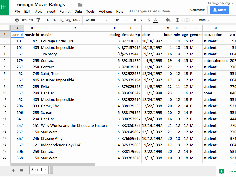
To start, make a copy of Teenage Movie Ratings Subset.csv and open it in a spreadsheet program.
- The data is a subset of the larger movie ratings dataset we saw in a previous lesson.
- The dataset contains roughly 300 movie ratings that were collected online in 1997-98.
- The data has been filtered so that it only contains movies that were rated by at least 2 females and 2 males in the 14-18 year-old range.
Making Summary Tables
We're first going to make a simple summary table that shows the average rating for every movie that's in the data.
Here is what we're going for:

Your First Summary Table
In most spreadsheet programs a Summary Table is called a pivot table.
Do This: With the spreadsheet open in Google Sheets choose Data -> Pivot table...
Creating a new pivot table
Add Rows and Values to Your Table
The menu on the right side of the pivot table lets you choose what you want the rows, columns, and values to be in your summary table. We want to set it up so that:
- Each row is one movie.
- Each value is the average rating of that movie.
Do This: Follow the animation below to make a table that displays the average rating for every movie listed in the data set.

Setting the Rows to "movie," Values to "rating," and Summarize By to AVERAGE
What Happened? Computation!
The power of the pivot table is that it allows you to compute things you could never do by just filtering and sorting. The pivot table is doing a lot of computing behind the scenes for you - which is great - but you should understand what's really happening so you can make your own choices in the future. Here's a synopsis:
-
Rows - Group By: movie
- Rows act like the major categories or groupings for which you want to calculate values.
- The Computation: When you set the rows to be "movie," the software finds all of the unique movie titles in the raw dataset and puts one on each row. This is called aggregation, which is a fancy word that means grouping or clustering.
-
Values - Display: rating; Summarize by: AVERAGE
- Values lets you specify the computation that should happen for each row.
- The Computation: We're interested in the average rating for each movie, so for Values we choose rating, Summarize by: AVERAGE.
Let's Change the Value - Summarize by: COUNT
Change summarize by from AVERAGE to COUNT. Now, instead of computing the average rating, this will count the number of ratings for each movie.

Switching summarize by from AVERAGE to COUNT. The result shows the total number of ratings for a given movie.
Add Another Field to Values
Let's show both the average rating and the count side-by-side in the table. To do this we add another Values field. The count is already there, so let's add the average rating again. Now, for each movie we'll see the total number of ratings the average rating.

Making a table that shows the average rating and number of ratings for every movie in the dataset.
That's It for the Basics of Pivot Tables!
There's not much more to it than that. Once you get the hang of pivot tables they can be a very powerful tool for manipulating data. There are more advanced things you can do with a pivot table if you like, but you know enough now that you can probably just play around with the other settings and see what happens.
Key Ideas:
-
Summary tables (pivot tables) provide a way to visualize data. Yes, it's a table, but by aggregating and summarizing information from a large data set, summary tables allow you to see things in the data you might otherwise not see.
-
Summary tables allow you to manipulate and create new data. Even for our simple movies example here, the raw data didn't contain the average rating for every movie, or count how many ratings there were. We had to compute it, and the pivot table let us do that quickly and easily.
-
A summary table helps you look at your data in new ways. Think: how could data be grouped? What could be calculated? Once you know how to make a summary table you can begin to look at raw data and ask questions that you know might be possible to answer.
-
A summary table can be a first step toward a good visualization. Often it's difficult to make a meaningful chart or graphic out of raw data. You often want to summarize it first, then chart it!
Click continue to see an example...
- Making Pivot Tables Part 2 - Manipulation and Visualization_2018_2019
- Student Overview
Making Pivot Tables Part 2 - Manipulation and Visualization
Adding Columns
Let's look at two more features of pivot tables that will allow you to do more complex investigations of your data.
We learned that a Row in a pivot table specifies an aggregation or grouping of items for which you want to compute a value. A Column in a pivot table is just another aggregation, but it displays the values across the top of the table. It's easier to understand when you see it...
Do This: Add columns that group your data by gender, as in the animation below.

Adding columns grouped by gender. The resulting table shows the average rating and count for each movie, but also broken down by gender. The pivot table also preserves the "Grand Totals" which is what the data would look like if no columns were specified.
Filtering Pivot Tables
Applying a filter to a pivot table does the same thing as it does in the normal spreadsheet - it allows you to filter out values from the raw data.
The animation below shows first filtering out 14-year-olds from the calculations, and then filtering out some of the movies. You don't have to do this, but in some instances it can be a very useful tool.

The Next Step - Manipulating the Pivot Table
If you want to maninpulate the data further, to sort or filter, you shouldn't do it in the live, active pivot table. Instead you should copy the table, and paste the values into a new spreadsheet.
Note: "Paste Values" is not the same as a normal "Paste".
Do This: Copy the pivot table, create a new tab in the spreadsheet and do Edit -> Paste special -> Paste values only. Watch the animation to see how.

Copying a pivot table, making a new tab in the spreadsheet, and pasting values.
"Why Paste values only instead of just Paste?"
-
If you copy a pivot table and do a normal paste it will paste another copy of the active, live, responsive pivot table into a new tab. We don't want the active table; we just want the values it produced.
-
You probably want to add/change column headings to display the table, especially to use it for charting. See the image below for how you might do this.

Changing column names to make them easier to read for a chart
From cleaning that up, plus some filtering we can make a chart of movies where the differences between male and female ratings are significant.

A chart showing movies with large differences in male vs. female ratings
Moving on: Visualizing Summary Tables
A summary table can be a good first step toward a great visualization. You often want to summarize data first, then chart it, so you can see larger connections or patterns.
Summary tables also don't have to be small! You might make a summary table that is still too big or full of numbers to see any trends in the data.
For example, from the original movie rating data (which had roughly 65,000 records) if you make a pivot table that shows the average movie rating for every possible age group the table will be about 75 rows long with a whole bunch of decimal numbers.
You can't see any trend or pattern in the data just by looking at the table. But if you plot the results on a graph you can!
| Summary Table | Chart |
|---|---|
 |
 |
NOTE: A deeper investigation of the data shows that the number of movies rated by people at this web site declined steadily after age 28. The upward trend may be affected by the fewer number of ratings.
Your Turn
Now you'll get a chance to play on your own.
- Making Pivot Tables Part 3
- 4
Student Instructions
Free Play!
Now you'll make summary tables of the data you collected and cleaned!
NOTE: The task below is a kick-off to the next lesson which is a Practice Performance Task. You don't have to make a chart of the pivot table today - you'll be doing that as part of the next project - but you might experiment.
Your Task
Create at least two (2) pivot tables that show different things about your data. With your partner, go back to the data you collected as a class (and which you cleaned up yesterday). Practice using pivot tables to group and calculate things you might be interested in.
Tips
There are two approaches to thinking about what kind of summary table to make:
- Work backward from a question: Start with a question you want to answer, or a hypothesis about something in the data you think you could reveal. Often the question itself tells you what calculations you need to make.
- Work forward by experimenting, iterating, and finding something interesting. Start by simply picking a category to group in rows. Then pick a second one to display as values, and try COUNT, AVERAGE, MIN, MAX, etc. By poking around ideas will come to you for interesting investigations.
Click "Continue" below to head to the next level.
- Check Your Understanding
- 5
Student Instructions
Standards Alignment
View full course alignment
Computer Science Principles
1.1 - Creative development can be an essential process for creating computational artifacts.
1.1.1 - Apply a creative development process when creating computational artifacts. [P2]
- 1.1.1A - A creative process in the development of a computational artifact can include, but is not limited to, employing nontraditional, nonprescribed techniques; the use of novel combinations of artifacts, tools, and techniques; and the exploration of personal cu
- 1.1.1B - Creating computational artifacts employs an iterative and often exploratory process to translate ideas into tangible form.
1.2 - Computing enables people to use creative development processes to create computational artifacts for creative expression or to solve a problem.
1.2.1 - Create a computational artifact for creative expression. [P2]
- 1.2.1A - A computational artifact is anything created by a human using a computer and can be, but is not limited to, a program, an image, audio, video, a presentation, or a web page file.
- 1.2.1B - Creating computational artifacts requires understanding and using software tools and services.
- 1.2.1E - Creative expressions in a computational artifact can reflect personal expressions of ideas or interests.
1.2.4 - Collaborate in the creation of computational artifacts. [P6]
- 1.2.4A - A collaboratively created computational artifact reflects effort by more than one person.
- 1.2.4B - Effective collaborative teams consider the use of online collaborative tools.
3.1 - People use computer programs to process information to gain insight and knowledge.
3.1.1 - Use computers to process information, find patterns, and test hypotheses about digitally processed information to gain insight and knowledge. [P4]
- 3.1.1A - Computers are used in an iterative and interactive way when processing digital information to gain insight and knowledge.
- 3.1.1B - Digital information can be filtered and cleaned by using computers to process information.
- 3.1.1C - Combining data sources, clustering data, and data classification are part of the process of using computers to process information.
- 3.1.1D - Insight and knowledge can be obtained from translating and transforming digitally represented information.
- 3.1.1E - Patterns can emerge when data is transformed using computational tools.
3.1.2 - Collaborate when processing information to gain insight and knowledge. [P6]
- 3.1.2D - Collaboration in developing hypotheses and questions, and in testing hypotheses and answering questions, about data helps participants gain insight and knowledge.
- 3.1.2E - Collaborating face-to-face and using online collaborative tools can facilitate processing information to gain insight and knowledge.
- 3.1.2F - Investigating large data sets collaboratively can lead to insight and knowledge not obtained when working alone.
3.1.3 - Explain the insight and knowledge gained from digitally processed data by using appropriate visualizations, notations, and precise language. [P5]
- 3.1.3A - Visualization tools and software can communicate information about data.
- 3.1.3B - Tables, diagrams, and textual displays can be used in communicating insight and knowledge gained from data.
- 3.1.3C - Summaries of data analyzed computationally can be effective in communicating insight and knowledge gained from digitally represented information.
- 3.1.3D - Transforming information can be effective in communicating knowledge gained from data.
3.2 - Computing facilitates exploration and the discovery of connections in information.
3.2.1 - Extract information from data to discover and explain connections, patterns, or trends. [P1]
- 3.2.1C - Computing tools facilitate the discovery of connections in information within large data sets.
- 3.2.1F - Software tools, including spreadsheets and databases, help to efficiently organize and find trends in information.
CSTA K-12 Computer Science Standards (2017)
DA - Data & Analysis
- 3A-DA-11 - Create interactive data visualizations using software tools to help others better understand real-world phenomena.
- 3B-DA-05 - Use data analysis tools and techniques to identify patterns in data representing complex systems.
- 3B-DA-06 - Select data collection tools and techniques to generate data sets that support a claim or communicate information.
- 3B-DA-07 - Evaluate the ability of models and simulations to test and support the refinement of hypotheses.
IC - Impacts of Computing
- 3A-IC-25 - Test and refine computational artifacts to reduce bias and equity deficits.