Lesson 2: Good and Bad Data Visualizations
Overview
This is a pretty fun lesson that has two main parts. First students warm up by reflecting on the reasons data visualizations are used to communicate about data. This leads to the main activity in which students look at some collections of (mostly bad) data visualizations, rate them, explain why a good one is effective, and also suggest a fix for a bad one.
In the second part of class students compare their experiences and create a class list of common faults and best practices for creating data visualizations. Finally, students review and read the first few pages of Data Visualization 101: How to design charts and graphs to see some basic principles of good data visualizations and see how they compare with the list the class came up with.
Purpose
An important skill is the ability to critically evaluate information. As our world is increasingly filled with data, more and more the information from that data is conveyed through visualizations. Visualization is useful for both discovery of connections and trends and also communication - both are potentially aspects of the Explore Performance Task. In this lesson we will focus on the communication aspects of visualization.
Interpreting data visualizations is not typically thought of as a core computer science skill, but it is certainly an important one in an age of digital data. Computing has enabled massive amounts of information to be automatically collected, aggregated, analyzed, and visualized. Visualizations are useful in helping humans understand large amounts of data quickly, and they are useful communication tools when presenting findings about a collection of data. Not all visualizations are created equal, however, and in many cases the type of visualization used may distract or even mislead the reader.
As both creators and consumers of data visualizations, students need to be on the lookout for these common pitfalls. This will allow them to be savvier readers of data visualizations, and more effective communicators when creating visualizations of their own.
Agenda
Getting Started (10 mins)
Activity (25 mins)
Wrap-up (15 mins)
Assessment
Extended Learning
View on Code Studio
Objectives
Students will be able to:
- Identify an effective data visualization and give justification.
- Collaborate to investigate and evaluate a data visualization.
- Suggest an appropriate visualization for some data.
- Evaluate a data visualization for effectiveness of communication.
- Identify a poor data visualization and give justification.
Preparation
- Print a copy of Data Visualization Scorecard - Worksheet for each student.
Links
Heads Up! Please make a copy of any documents you plan to share with students.
For the Students
- Data Visualization 101: How to design charts and graphs - Link
- Data Visualization Scorecard - Worksheet
- Data Visualization Collection A & B (in Code Studio)
Teaching Guide
Getting Started (10 mins)
Fill out class tracker survey
Survey Reminder: Give students a few minutes to fill out the class tracker survey that you started in Lesson 1 - Introduction to Data.
Think-Pair-Share: Why Make Visualizations?
Remarks
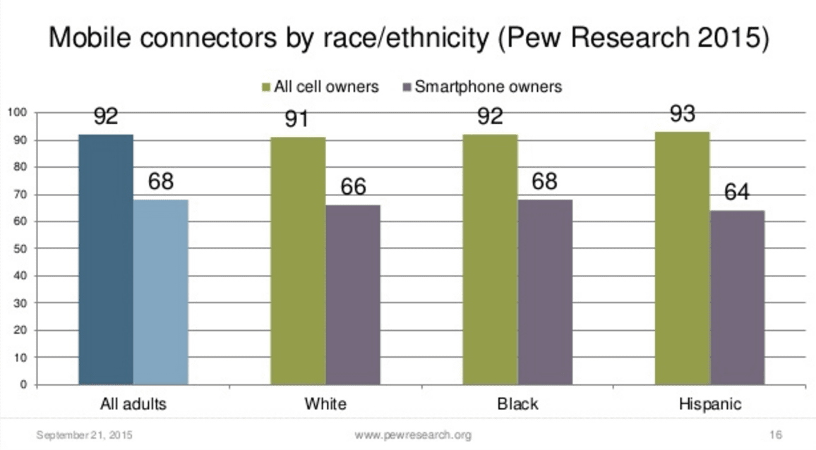
Yesterday you looked at a bunch of data from the Pew Research Center that was all presented visually in graphs and charts. The question is: why? Why did they choose to make a bunch of charts and graphs rather than just showing the raw data itself?
Prompts:
Here are two related prompts to respond to:
-
"Why did Pew Research choose to make a bunch of charts and graphs rather than just showing the raw data itself?"
-
"List a few advantages and disadvantages (at least 2 for each) of using visualizations to communicate data"
Discussion Goal
The goal here is to do a quick thinking prompt to activate prior knowledge about visualizations. There are two key points to draw out:
- Visualization is about communication. The goal of any data visualization is to transform data into useful information.
- There are both advantages and disadvantages to data visualizations - some of the disadvantages might not be as clear at this point but they will be after this lesson. The disadvantages mostly stem from the fact that human error and bias can be introduced when trying to communicate.
Pair: Have students share with an elbow part.
Share: Draw out responses from the a whole class to generate common themes.
Here are a few notes to help guide the discussion:
Why visualize?"
- Student responses should focus on communication. You choose to make a chart because you think it's a better or more effective way to communicate information than using raw data.
Advantages / Disadvantages
- Advantages: pictures allow you to compare things more easily, easier to see trends or patterns, can focus on, or highlight, particular aspects of the data that are important
- Disadvantages: easy to mislead or miscommunicate, removes details that might be important or valuable, sometimes very dense - takes a while to study to understand what it means.
Activity (25 mins)
Remarks
Making even a small visualization may have been surprisingly challenging and varied.
In fact, even experienced data analysts can end up obscuring their message when they make data visualizations.
To better understand some of the skills we just read about, we are going to evaluate a collection of data visualizations to determine how well they communicate their message.
Review and Rate Data Visualizations
Pair: Partner students who will work through the worksheet together.
Assign: There are two different collections of data visualizations. Each pair of students should be assigned to evaluate one of either:
- Data Visualization Collection A
or
- Data Visualization Collection B
Links to the separate collections can be found in Code Studio
Distribute: Worksheet - Data Visualization Scorecard - Worksheet
(There is a link to the worksheet in Code Studio, but this is one you probably want printed out.)
![]() Transition to Good and Bad Visualizations on Code Studio
Transition to Good and Bad Visualizations on Code Studio
The worksheet asks pairs of students to collaborate in reviewing the data visualizations:
- Give a rating from “Great” to “Horrible” for 15 different data visualizations.
- Choose the best (or favorite one) and explain why it effectively tells a story or communicates some data.
- Choose the worst (or a bad one) and explain why it’s ineffective.
- Optional: Suggest (via a sketch) a better visual that could represent the same data.
Teaching Tip
Compare with Different Groups: Collection A and Collection B have different sets of visualizations. There are benefits to discussing with both a group that used the same collection of visualizations and with a group that used a different one. Time allowing, encourage groups to share their findings with groups who used both collections of visualizations.
Share:
After completing the worksheet, have each group share the best and worst image from their set with another group. Groups should focus on how they would fix the worst visualization they chose. Share and exchange ideas about different ways to visualize the data.
Debrief: What makes a good/bad data visualization?
Have a discussion with two main parts...
Part one: Share out best/worst
Teaching Tip
To be creative with the share-out, you could:
- Have students vote publicly on each one in some way
- Have the groups that looked at Collection A all get together and figure out a best/worst to show to the other group(s) that looked at Collection B, and vice versa.
- Ask student pairs to share the graphic they rated the worst and best.
- Focus on one or two and have all students look at it (bring up on a projector or have all students bring it up on screen).
- Ask students to justify or give reasons why they rated the graphic highly or poorly.
Discussion Goal
Summarize the findings from the visualizations work by examining two visualizations that present the same information in starkly different ways. As part of the discussion...
- Students should recognize that the two graphics are plotting the same data.
- Build a list of good/bad properties of data visualizations.
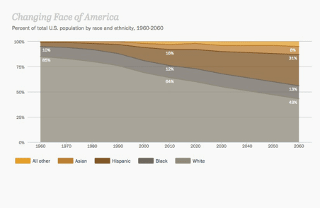
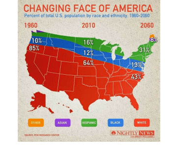
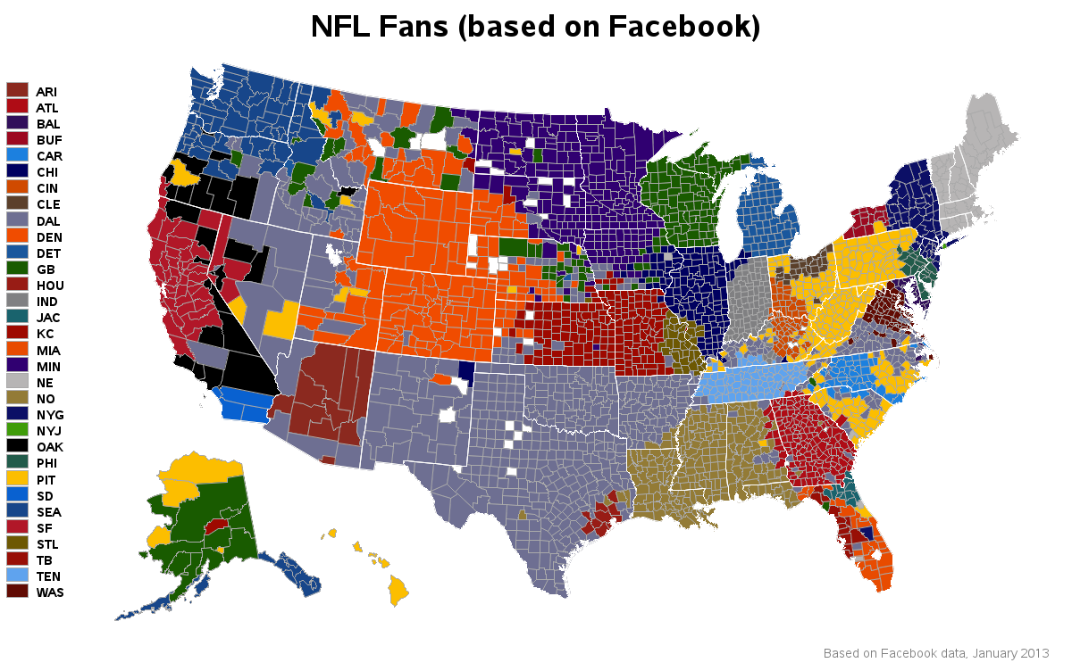
Part 2: Discuss graphic number 5 - The Changing Face of America
Graphic number 5 in both collections are two different displays of the same data. For reference, here are snapshots of both graphics.
You might display these on the screen, or have students look together by sitting next to each other and opening up the graphic from each collection.
 |
 |
Prompt:
"Can everyone please look at graphic number 5 in their collection. It’s called “The Changing Face of America.”
Whip around:
- How did different groups rate this graphic?
- What data is presented?
- What is the difference between the two visualizations?
Students should recognize that the two graphics are attempting to represent the same data.
Make a table of good v. bad visualization characteristics
Teaching Tip
Strategies for bringing out charateristics of good/bad visualizations:
- fill in a chart at the front of the room as students talk
- Have students write ideas on post-its and attach to a centrally located chart as basis of dicussion
- Have students add ideas and comments to a shared online document
Prompts:
- Following the principles of good data visualization, which one would we say is better?
- What makes the good one good and the bad one bad?
As students respond, steer the discussion toward generating general characteristics of good and bad visualizations. Make a simple chart that everyone can see.
Something like this...
| Good | Bad |
|---|---|
Wrap-up (15 mins)
Data Visualization 101 discussion
Discussion Goal
Establish some rules of thumb for visual displays of data. Students should recognize that some types of charts are more appropriate than others, depending on the nature of the data or the message the author is trying to convey.
Remarks
We’re going to be making some of our own visualizations of data very soon. To help us do that, we’re going to look at some helpful tips for effectively communicating with data visualization.
Teaching Tip
Reading Strategies: Students can read individually, in partners, or as a whole class. The guide is not particularly long, but you’ll want all students to have had a chance to look through those pages before the discussion. Let students know ahead of time that you’ll be discussing the reading and ask them to pick one or two key points as they are going through.
Distribute: Data Visualization 101: How to design charts and graphs - Link. Students should read the first 4 pages of this document.
Discuss: What are the key take-aways from this guide?
Some key ideas that should come up:
- Choosing the right way to visualize data is essential to communicating your ideas.
- There are stories in data; visualization helps you tell them.
- Before understanding visualizations, you must understand the types of data that can be visualized and their relationships to each other.
- Certain chart types are right for certain situations, depending on the data.
Remarks
The Data Visualization 101 guide is a resource for you (students).
The rest of the guide goes into some specifics of different chart types.
You should keep this guide at your side as you review visualizations data, and when you develop your own in the future.
Further Discussion Points: What else did we learn about data visualization today?
- What are the benefits of visualizing data?
- Can we characterize common mistakes in visualizations to which we gave low ratings?
- Can we characterize common strengths in effective visualizations?
- Not all visualizations were charts; what other types are there?
- As you embark on making your own visualization, what do you want to keep in mind so that you can avoid rookie mistakes?
Assessment
Assessment Posibilities
- Assessment Idea: show students a visualization and have them analyze it, using the table of characteristics of good/bad visualizations to justify their opinion.
Performance Task-style reflection question
Choose the visualization that you thought was the best or worst (pick one) from the ones you saw in class and do the following:
- Describe the visualization so the reader knows which one you are talking about (example: "Collection A #2 -- Average divorce rates in America")
- Say whether this was the best or worst visualization for you and and why. Justify your opinion by citing principles of visualizations that you have learned about. Use the visualization 101 guide as a resource.
- Try to keep your response to around 100 words (about 3-5 sentences).
Extended Learning
If you want additional sources of data visualizations, consider the following sources:
- Daily Infographic: http://www.dailyinfographic.com/
- Infographics Archive: http://www.infographicsarchive.com/
- Lesson Overview
- Student Overview
- Collection A: Good and Bad Visualizations_2018_2019
- Student Overview
Collection A: Good and Bad Data Visualization
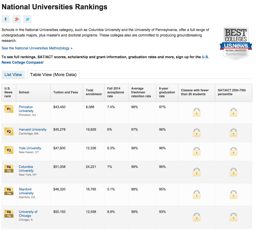
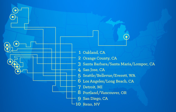
NOTE: if you need to see a visualization more clearly click on the Source link below any image to take you to the original.
Visualization One (1)

Visualization Two (2)

Visualization Three (3)

See it live for more. Source
Visualization Four (4)

Visualization Five (5)

Visualization Six (6)

Visualization Seven (7)

Vimeo Link Midday Traffic Time Collapsed and Reorganized by Color: San Diego Study #3 from Cy Kuckenbaker
Visualization Eight (8)

Visualization Nine (9)
Visualization Ten (10)

More info about this here: Source
Visualization Eleven (11)

Visualization Twelve (12)

Visualization Thirteen (13)

Visualization Fourteen (14)

Visualization Fifteen (15)

- Collection B: Good and Bad Visualizations_2018_2019
- Student Overview
Collection B: Good and Bad Data Visualization
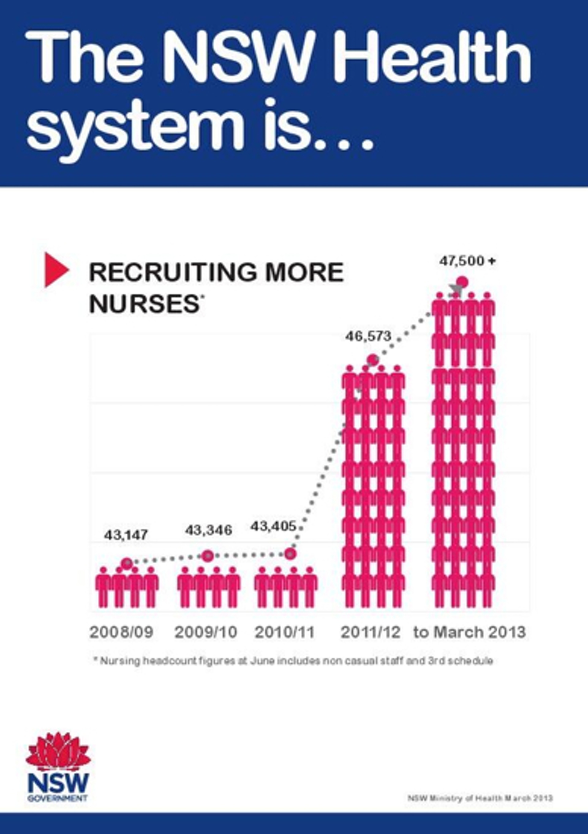
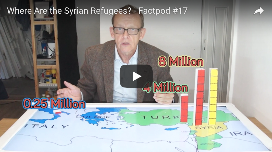
NOTE: If you're having trouble seeing an image, click on the Source link below it to take you to the original.
Visualization One (1)

Visualization Two (2)

Visualization Three (3)
Visualization Four (4)
Visualization Five (5)

Visualization Six (6)
Visualization Seven (7)
Visualization Eight (8)

Visualization Nine (9)

Visualization Ten (10)
Visualization Eleven (11)

Visualization Twelve (12)

Click to see more: Source
Visualization Thirteen (13)

Visualization Fourteen (14)
Visualization Fifteen (15)
- Check Your Understanding
- 4
Student Instructions
Choose the visualization that you thought was the best or worst (pick one) from the ones you saw in class and do the following:
-
Describe the visualization so the reader knows which one you are talking about (example: "Collection A #2 -- Average divorce rates in America")
-
Say whether this was the best or worst visualization for you and and why. Justify your opinion by citing principles of visualizations that you have learned about. Use the visualization 101 guide as a resource.
Try to keep your response to around 100 words (about 3-5 sentences).
Standards Alignment
View full course alignment
Computer Science Principles
1.2 - Computing enables people to use creative development processes to create computational artifacts for creative expression or to solve a problem.
1.2.5 - Analyze the correctness, usability, functionality, and suitability of computational artifacts. [P4]
- 1.2.5A - The context in which an artifact is used determines the correctness, usability, functionality, and suitability of the artifact.
- 1.2.5B - A computational artifact may have weaknesses, mistakes, or errors depending on the type of artifact.
- 1.2.5C - The functionality of a computational artifact may be related to how it is used or perceived.
- 1.2.5D - The suitability (or appropriateness) of a computational artifact may be related to how it is used or perceived.
3.1 - People use computer programs to process information to gain insight and knowledge.
3.1.1 - Use computers to process information, find patterns, and test hypotheses about digitally processed information to gain insight and knowledge. [P4]
- 3.1.1D - Insight and knowledge can be obtained from translating and transforming digitally represented information.
- 3.1.1E - Patterns can emerge when data is transformed using computational tools.
3.1.2 - Collaborate when processing information to gain insight and knowledge. [P6]
- 3.1.2A - Collaboration is an important part of solving data driven problems.
- 3.1.2B - Collaboration facilitates solving computational problems by applying multiple perspectives, experiences, and skill sets.
- 3.1.2C - Communication between participants working on data driven problems gives rise to enhanced insights and knowledge.
- 3.1.2D - Collaboration in developing hypotheses and questions, and in testing hypotheses and answering questions, about data helps participants gain insight and knowledge.
- 3.1.2F - Investigating large data sets collaboratively can lead to insight and knowledge not obtained when working alone.
3.1.3 - Explain the insight and knowledge gained from digitally processed data by using appropriate visualizations, notations, and precise language. [P5]
- 3.1.3A - Visualization tools and software can communicate information about data.
- 3.1.3B - Tables, diagrams, and textual displays can be used in communicating insight and knowledge gained from data.
- 3.1.3C - Summaries of data analyzed computationally can be effective in communicating insight and knowledge gained from digitally represented information.
- 3.1.3D - Transforming information can be effective in communicating knowledge gained from data.
- 3.1.3E - Interactivity with data is an aspect of communicating.
CSTA K-12 Computer Science Standards (2017)
DA - Data & Analysis
- 3B-DA-06 - Select data collection tools and techniques to generate data sets that support a claim or communicate information.
- 3B-DA-07 - Evaluate the ability of models and simulations to test and support the refinement of hypotheses.
IC - Impacts of Computing
- 3A-IC-25 - Test and refine computational artifacts to reduce bias and equity deficits.