Post AP
In this unit students develop skills interpreting visual data and using spreadsheet and visualization tools to create their own digital artifacts. Through an ongoing project - the “class data tracker” - students learn how to collect and clean data, and to use a few common tools for computing aggregations and creating visualizations.
Note: The lessons in Chapter 2 of this unit do not have lesson plans and are only available to students on Code Studio. These lessons teach students to use the database tools included in App Lab. These lessons were originally intended to be a part of the core curriculum pathway but eventually were removed from Unit 5 due to timing concerns. As a result lesson plans were never developed. Even so many teachers have successfully used Chapter 2 of this unit in their classrooms. For help and support we highly recommend you speak with other teachers on the Code.org forum at forum.code.org/c/csp!
Chapter 1: Manipulating and Visualizing Data
Big Questions
- What is the relationship between data, information and knowledge?
- What are the best ways to find, see, and extract meaningful trends and patterns from raw data?
- Where and how does human bias affect the collection, processing and interpretation of data?
Enduring Understandings
- 1.3 Computing can extend traditional forms of human expression and experience.
- 3.1 People use computer programs to process information to gain insight and knowledge.
- 3.2 Computing facilitates exploration and the discovery of connections in information.
- 3.3 There are trade offs when representing information as digital data.
- 7.1 Computing enhances communication, interaction, and cognition.
- 7.3 Computing has a global affect -- both beneficial and harmful -- on people and society.
Week 1
Lesson 1: Introduction to Data
Unplugged | External Tools | Individual and Group Discovery
- Teacher Setup (10 mins)
- Getting Started (20 mins)
- Activity (25 mins)
- Wrap-up
Students examine sources of data in the world around them how that data is collected. The Class Data Tracker project is introduced, and students predict what they will find after all the data has been collected.
Teacher Links: Google Form Setup (includes template) Student Links: Link
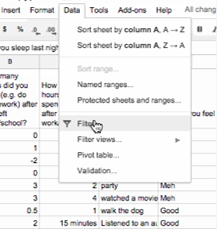
Lesson 2: Good and Bad Data Visualizations
Analyzing Artifacts | Group Discovery | Class Discussion
- Getting Started (10 mins)
- Activity (25 mins)
- Wrap-up (15 mins)
- Assessment
- Extended Learning
As a precursor to creating their own data visualizations, students examine collections of (mostly bad) data visualizations, rate them and discuss the characteristics of good v. bad visualizations.
Student Links: Link | Worksheet |
Lesson 3: Making Data Visualizations
External Tools | Individual Skill Building | Tutorial
- Getting Started
- Activity
- Wrap-up (10 mins)
- Assessment
- Extended Learning
Students follow a guide to learn how to make scatter, bar, and line charts out of provided data using a spreadsheet tool (such as Google sheets or MS Excel).
Teacher Links: Answer Key Student Links: Link | Data Set
Week 2
Lesson 4: Discover a Data Story
External Tools | Collaborative Artifact Creation | Writing
- Getting Started (10 mins)
- Activity (40 mins)
- Wrap Up (10 mins)
- Assessment
Students collaboratively investigate some datasets (provided) to “discover a data story.” Students choose one dataset, create a visualization, identify a trend, and accurately write about it.
Student Links: Activity Guide | Link | Rubric | Folder
Lesson 5: Cleaning Data
External Tools | Analyzing | Group Skill Building
- Getting Started (5 mins)
- Activity (40 mins)
- Wrap Up (5 mins)
- Assessment
Students begin working with the data that they have been collecting for the Class Data Tracker project by first "cleaning" it to prepare it for visualization and other analyses. Each team makes their own copy of the data to examine, correct errors, categorize ambiguous items, and perform other cleaning tasks.
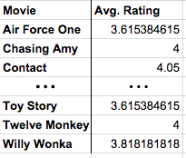
Lesson 6: Creating Summary Tables
External Tools | Artifact Creation | Analyzing
- Getting Started
- Activity (90 mins)
- Wrap Up
- Assessment
Students learn how create summary tables (also known as pivot tables) from some raw datasets provided in a spreadsheet tool. Then students create and use summary tables to investigate data they’ve collected as a class.
Week 3
Lesson 7: Practice PT - Tell a Data Story
Practice PT | External Tools | Artifact Creation | Project
- Getting Started
- Activity (up to 3 days)
- Wrap Up
- Assessment
Students continue to analyze their class tracker project data to discover, visualize, write about and present a trend or pattern they find. The writing prompts are reflective of prompts from the AP Explore Performance Task.
Student Links: Rubric
Chapter Commentary
Post AP - What’s the story?
The story of this chapter is about how data can be manipulated to extract or reveal new information. Up to this point we have been focused primarily on bits and what they can be used to represent. Now we’re taking a big step back to do the inverse: we want to use tools meant for viewing, manipulating, and visualizing data in order to extract or find new information.
The lessons in this chapter often have two things going on at once. In the background, the class is daily collecting some data about themselves (the “Class Data Tracker project”) in order to accumulate data to process later on. In the interim, students are learning about and developing skills with spreadsheet and visualization tools. The goal is for students to learn a few basic skills, see lots of examples, and then apply what they know to the Tell A Data Story project at the end of the chapter.
A big part of the story here is for students to understand the computer scientist’s role in working with data, which means emphasizing how to use tools to manipulate, compute, and visualize the data. We look at things like making sure that data type choices support the way we intend to process it later (e.g. don’t collect text when you need a number). Data inevitably gets “dirty” during collection and needs to be cleaned. Computers are really useful for doing some aggregations and visualizations to look for patterns. Along the way, we need to understand how human bias can be introduced at each step so that we can accurately convey what patterns in the data are or are not telling us. These activities help build toward the enduring understanding that there are trade offs when representing information as digital data.
Our Approach to the Content
The lessons in this chapter lean heavily on external tools, especially spreadsheets. The benefit is that students will gain experience with real tools and real data for the first time. The pitfall is that, because the tools are external, they are not scaffolded or designed for learning. We have tried to provide tutorials and curated data sets to ease the burden as much as possible, but ultimately you’re operating in the real world. While confined to the world of your classroom, the Class Data Tracker project should provide some authentic examples, scenarios, and sometimes headaches related to data collection and processing in the real world.
As the teacher it’s important to keep in mind the goals of CS Principles because it can be enticing with these lessons to dig into “hardcore” data analysis techniques and statistics. While these are important, they are beyond the scope of CS Principles. Thus, we treat data analysis and statistics a bit like an electric fence: get close, but don’t touch. Students should be able to extract interesting things as the result of letting the tools do the work. We provide some large sets of curated data that came from real sources. The data is big enough that you have to apply some computation to make sense of it. We show how to use spreadsheets to do basic aggregations (such as grouping, counting, clustering) and computations (such as average, median, etc.), without turning it into a lesson on statistics and data analysis. We want to build toward the enduring understanding that computing facilitates exploration and the discovery of connections in information.
The idea behind the Class Data Tracker project is that we have found that when students work with data that they collected themselves it is easier and intrinsically motivating for students to dig in. To accumulate enough data, we collect it in increments during the time they’re building up other skills with data tools. You should connect the skills students are learning in the exercises to similar things they might do with the class tracker data for the Tell a Data Story project.