Session 4: Unit 9 Lesson Jigsaw
95 minutes
lesson exploration
Purpose
Unit 9 contains some new tools in the curriculum such as the Google Trends tool and the data visualizer tool. This session is intended to help participants understand each lesson at a high level while the facilitator provides the “connective tissue” between the lessons. Data does provide opportunities to also connect to students’ interests which comes through at the end of the unit project. We want to emphasize this opportunity to celebrate the diversity of projects that students develop during this unit.
Objectives
- Participants are familiar with the Google Trends and data visualization tools in this unit.
- Participants understand how each lesson connects to the “big picture” of the unit.
- Participants have developed a plan for how they will celebrate and support the projects students create in the unit.
Supplies & Prep
Agenda
Introduction to Unit 9 (10 minutes)
Unit 9 Jigsaw (35 minutes)
Jigsaw Share Out (40 minutes)
Unit 9 Project Overview (10 minutes)
Facilitation Guide
Introduction to Unit 9 (10 minutes)
(2 minutes) Introduce Unit 9 - Data
💷 Use the slides to guide your review of the unit. Key points to pull out include:
- Students will use the datasets in App Lab along with the data visualizer tool in App Lab to learn new information from the dataset.
- Along the way students will use the Data Analysis Process to make sense of the data.
- Students will also learn how computers use datasets for machine learning.
(8 minutes) Using the Data Visualizer
💷 Demonstrate the features of the data visualizer. Participants will not be following along on their own computers. Right now, you are just demonstrating what it looks like to use the data visualizer, and they will be able to use this tool in the future themselves.
Use U9L2, Level 1 or the slideshow to show participants a video for how the visualizer works. The video will review how to:
- Import a dataset
- Look at the metadata of a dataset
- Create a bar chart and histogram in the data visualizer
The video does not cover how to filter the data in the data visualizer, so below is a recommended set of steps to follow to demonstrate this. We highly recommend using a dataset that highlights a topic that may support building an inclusive classroom environment. In the example below, we are using the data set “TheRoot: 100 Influential African Americans”. It is recommended that you test this out yourself before doing this live demo in front of participants.
| What you should see | What you should do |
|---|---|
 |
Go to U9L2, Level 2 and select the “Data Tab” in the top left hand side. |
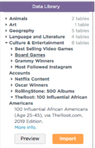 |
In the “Data Library” panel, select “Culture & Entertainment” and “TheRoot: 100 Influential African Americans”. Click the orange “Import” button. You will see this data set now listed in the “Table name” chart on Code Studio. |
 |
Click on the name of the data set in the “Table name” chart. This will take you to a screen that shows the data in a spreadsheet form. |
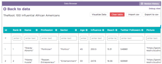 |
Click on the button “Visualize Data” near the top of the screen. |
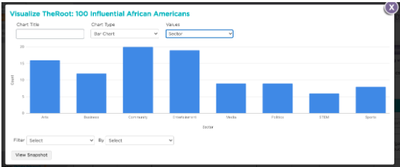 |
Create a histogram by following these steps: 1. Select “Histogram” in the “Chart Type” dropdown. 2. Select 5 as the “Bucket Size” 3. Select “Age” in the “Values” dropdown. Your chart should look like the image to the left. |
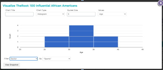 |
Filter your data by following these steps: 1. Select “Sector” in the “Filter” dropdown. 2. Select “Sports” in the “By” dropdown. Your chart should look like the image to the left. Again, this might be a good opportunity to allow participants to make observations about the differences between these graphs. |
Remind participants that this is a high-level overview of the tool.
Unit 9 Jigsaw (35 minutes)
(3 minutes) 💷 Introduce the Task
Remarks
We are going to look at each lesson in Unit 9 in a “Jigsaw format”. We will break up into 6 groups and assign each group a lesson to look at. Your goal is to share the “big picture” of the lesson with the group and point out aspects of the lesson you and your group found particularly important. You will have 4 minutes to share out about your lesson.
(32 minutes) Jigsaw Activity
Facilitator Tip
If your cohort group size doesn’t allow for forming six different groups, consider having groups double up or allowing participants to work individually. Ideally everyone will be able to work with at least one other person. If you need one or two “groups” of one person, we recommend assigning U9L5 or U9L6 to one person groups, as those lessons require fewer tools than the other lessons and thus may be easier for folks to understand independently.
💷 Divide the room into six different groups. Assign Lessons 1-3 and 5-7 to groups. The facilitators will be responsible for talking about Lesson 4 since it builds on previous lessons. Lessons 8 and 9 are focused on a project which the facilitators will also review with the group at the end of the session.
As you circulate the room, help participants learn how to use the tool. Encourage them to try different settings in the tools and with different datasets as they understand the lesson structure.
Jigsaw Share Out (40 minutes)
Have each group share out their 4 minute overview of the lesson. Groups may either talk out loud, use the shared slide, or model functionality using the computer connected to the projector. You should not spend time swapping out computers.
We also encourage you, the facilitator, to provide transitional remarks between the lessons. Below are sample transitional remarks along with what we are asking you to highlight:
Lesson 1-2 transitional remarks: After lesson 1, students are familiar with looking at the data behind the data as well as making sense of a variety of different charts in Google Trends. While students do a lot of exploration during this lesson, the following lesson we focus on datasets in App Lab and reading bar charts and histograms.
Lesson 2-3 transitional remarks: In Lesson 2, students worked with a pretty easy to understand dataset. But datasets aren’t always that straight forward. In the next lesson we will see that depending on how data is collected, data scientists might need to modify the dataset before they even get to creating visualizations of that data.
Lesson 3-4 transitional remarks: In Lesson 3, students also learned that sometimes it is helpful to “drill down” into a smaller data set, much like how we drilled down to see the distribution of ages in “TheRoots” dataset earlier today. In this next lesson, we will see drill down to another layer of analysis as we create more complex data visualizations.
Lesson 4: Facilitator-Led Overview
Remarks
Lesson 4 introduces students to cross tab charts and scatter charts. Out of these, the crosstab chart might be most unfamiliar to your students.
💷 Use the slide to show participants how to read the crosstab chart.
Remarks
In the lesson, students also create their own crosstab and scatter chart using the data visualizer. There is an activity guide that walks through these activities. Students will use the “Words”, “Favorite Classes”, and “US States” dataset to create a variety of charts.
💷 At the end of the lesson, we summarize the variety of different charts students have seen up to this point.
Lesson 4-5 transitional remarks: In prior lessons, we have taken a look at specific data stories that were centered around specific topics (chocolate, dogs, female legislatures, etc). In Lesson 5, we zoom out and look at how data is gathered in society and how it is used or misused.
Lesson 5-6 transitional remarks: In this next lesson, we take a look further at the role data plays in society - this time through the lens of machine learning and AI.
Facilitator Tip
Lesson 7 is a new lesson in the 2021-2022 school year. Make sure to review it along with all of the other lessons in this unit for these remarks.
Lesson 6-7 transitional remarks: It includes an activity, video, and article about bias in the Twitter facial recognition algorithm. This lesson builds on the way programmers feed data to AI - for better or worse.
After the last group presents, thank everyone and move on to the project.
Unit 9 Project Overview (10 minutes)
(5 minutes) 💷 Review the Task
Remarks
This unit ends with a project that spans two lessons in the unit. Students will use an activity guide to help them with the task which walks them through the Data Analysis Process. Please open and review the activity guide linked in the slides. As you review the task consider the following:
- How does the project itself lend itself to building an inclusive learning environment for students?
- How might you modify it for your students to make it more of an inclusive learning experience for students?
- What actions can you take during the project to build an inclusive classroom?
(5 minutes) 💷 Discussion and Share Out
Facilitator Tip
Examples of actions or modifications that could work against building an inclusive classroom include requiring students to use a specific data set rather than using one of their own choosing or looking the other way when students make remarks about bias in data not being important.
- How does the project itself support creating an inclusive classroom environment?
- What role do you play in either modifying the project or supporting a classroom culture that creates an inclusive classroom environment?
- What are things a teacher might do or say during this project that might work against the goal of supporting an inclusive classroom environment?
Remarks
After lunch we will wrap-up Unit 10 and brainstorm strategies for supporting students in taking the AP exam.