Unit 2 - Digital Information
This unit further explores the ways that digital information is encoded, represented and manipulated. In this unit students will look at and generate data, clean it, manipulate it, and create and use visualizations to identify patterns and trends.
Many of the lessons that follow have worksheets and student guides associated with activities. Those worksheets are listed in the relevant lesson plan, or you can check out all unit 2 student-facing activity guides here. You can access a flat pdf of all the lessons in unit 2 here.
Chapter 1: Encoding and Compressing Complex Information
Big Questions
- Are the ways in which digital information is encoded more laws of nature or man made?
- What kinds of limitations does the binary encoding of information impose on what can be represented inside a computer?
- How accurately can human experience and perception be captured or reflected in digital information?
Enduring Understandings
- 1.1 Creative development can be an essential process for creating computational artifacts.
- 1.3 Computing can extend traditional forms of human expression and experience.
- 2.1 A variety of abstractions built upon binary sequences can be used to represent all digital data.
- 3.3 There are trade offs when representing information as digital data.
Week 1
Lesson 1: Bytes and File Sizes
Research
 Students are introduced to the standard units for measuring the sizes of digital files: bytes, kilobytes, megabytes, gigabytes, etc. and research the sizes of files they make use of every day.
Lesson 2: Text Compression
Widget - Text Compression | Individual and Group Discovery
 At some point we reach a physical limit of how fast we can send bits and if we want to send a large amount of information faster, we have to find a way to represent the same information with fewer bits - we must compress the data.
Lesson 3: Encoding B&W Images
Widget - Pixelation | Concept Invention | Individual Creation
 Students explore methods for encoding digital images in binary which requires representing metadata such as width and height as well as pixel data. Students use the the Pixelation widget to encode simple B&W raster images.
Week 2
Lesson 4: Encoding Color Images
Widget - Pixelation | Individual Creation
 Students learn about the RGB color encoding scheme and use an updated version of the pixelation widget to encode color images. Hexadecimal notation is useful for representing larger groupings of binary digits.
Lesson 5: Lossy Compression and File Formats
Research
 Students research real compression schemes used for images, text, or sound and determine what kind of compression it uses - lossy or lossless - explaining the theory behind it.
Week 3
Lesson 6: Practice PT - Encode an Experience
Practice PT | Unplugged | Individual Creation
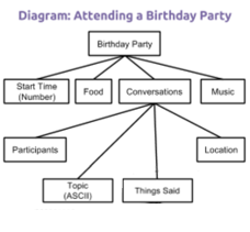 Students break down an ambiguous type of information such as personal experience (attending a party, playing a game, etc) and invent a way to encode its sub-parts. The project includes a written reflection questions similar to those students will see on the AP Performance Tasks.
Chapter 2: Manipulating and Visualizing Data
Big Questions
- What is the relationship between data, information and knowledge?
- What are the best ways to find, see, and extract meaningful trends and patterns from raw data?
- Where and how does human bias affect the collection, processing and interpretation of data?
Enduring Understandings
- 1.3 Computing can extend traditional forms of human expression and experience.
- 3.1 People use computer programs to process information to gain insight and knowledge.
- 3.2 Computing facilitates exploration and the discovery of connections in information.
- 3.3 There are trade offs when representing information as digital data.
- 7.1 Computing enhances communication, interaction, and cognition.
- 7.3 Computing has a global affect -- both beneficial and harmful -- on people and society.
Week 4
Lesson 7: Introduction to Data
Unplugged | External Tools | Individual and Group Discovery
 Students examine sources of data in the world around them how that data is collected. The Class Data Tracker project is introduced, and students predict what they will find after all the data has been collected.
Lesson 8: Finding Trends with Visualizations
External Tools | Research | Presentation
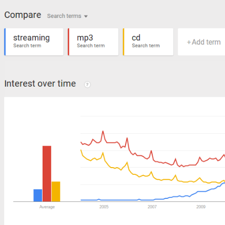 Students use the Google Trends tool in order to identifying patterns in historical search data. Students present their findings, differentiating between explanations of what the data shows versus plausible explanations for discovered patterns.
Lesson 9: Check Your Assumptions
Research | Class Discussion
 Students examine the assumptions they make when interpreting data and visualizations by first reading a report about the "Digital Divide" which challenges the assumption that data collected online is representative of the population at large. Students also evaluate a series of scenarios in which data-driven decisions are made based on flawed assumptions.
Lesson 10: Good and Bad Data Visualizations
Analyzing Artifacts | Group Discovery | Class Discussion
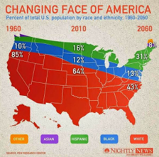 As a precursor to creating their own data visualizations, students examine collections of (mostly bad) data visualizations, rate them and discuss the characteristics of good v. bad visualizations.
Week 5
Lesson 11: Making Data Visualizations
External Tools | Individual Skill Building | Tutorial
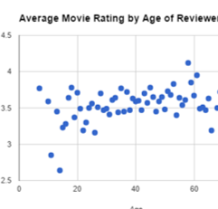 Students follow a guide to learn how to make scatter, bar, and line charts out of provided data using a spreadsheet tool (such as Google sheets or MS Excel).
Lesson 12: Discover a Data Story
External Tools | Collaborative Artifact Creation | Writing
 Students collaboratively investigate some datasets (provided) to “discover a data story.” Students choose one dataset, create a visualization, identify a trend, and accurately write about it.
Week 6
Lesson 13: Cleaning Data
External Tools | Analyzing | Group Skill Building
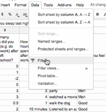 Students begin working with the data that they have been collecting for the Class Data Tracker project by first "cleaning" it to prepare it for visualization and other analyses. Each team makes their own copy of the data to examine, correct errors, categorize ambiguous items, and perform other cleaning tasks.
Lesson 14: Creating Summary Tables
External Tools | Artifact Creation | Analyzing
 Students learn how create summary tables (also known as pivot tables) from some raw datasets provided in a spreadsheet tool. Then students create and use summary tables to investigate data they’ve collected as a class.
Lesson 15: Practice PT - Tell a Data Story
Practice PT | External Tools | Artifact Creation
 Students continue to analyze their class tracker project data to discover, visualize, write about and present a trend or pattern they find. The writing prompts are reflective of prompts from the AP Explore Performance Task.
Chapter Commentary
Unit 2 Chapter 2 - What’s the story?
The story of this chapter is about how data can be manipulated to extract or reveal new information. Up to this point we have been focused primarily on bits and what they can be used to represent. Now we’re taking a big step back to do the inverse: we want to use tools meant for viewing, manipulating, and visualizing data in order to extract or find new information.
The lessons in this chapter often have two things going on at once. In the background, the class is daily collecting some data about themselves (the “Class Data Tracker project”) in order to accumulate data to process later on. In the interim, students are learning about and developing skills with spreadsheet and visualization tools. The goal is for students to learn a few basic skills, see lots of examples, and then apply what they know to the Tell A Data Story project at the end of the chapter.
A big part of the story here is for students to understand the computer scientist’s role in working with data, which means emphasizing how to use tools to manipulate, compute, and visualize the data. We look at things like making sure that data type choices support the way we intend to process it later (e.g. don’t collect text when you need a number). Data inevitably gets “dirty” during collection and needs to be cleaned. Computers are really useful for doing some aggregations and visualizations to look for patterns. Along the way, we need to understand how human bias can be introduced at each step so that we can accurately convey what patterns in the data are or are not telling us. These activities help build toward the enduring understanding that there are trade offs when representing information as digital data.
Our Approach to the Content
The lessons in this chapter lean heavily on external tools, especially spreadsheets. The benefit is that students will gain experience with real tools and real data for the first time. The pitfall is that, because the tools are external, they are not scaffolded or designed for learning. We have tried to provide tutorials and curated data sets to ease the burden as much as possible, but ultimately you’re operating in the real world. While confined to the world of your classroom, the Class Data Tracker project should provide some authentic examples, scenarios, and sometimes headaches related to data collection and processing in the real world.
As the teacher it’s important to keep in mind the goals of CS Principles because it can be enticing with these lessons to dig into “hardcore” data analysis techniques and statistics. While these are important, they are beyond the scope of CS Principles. Thus, we treat data analysis and statistics a bit like an electric fence: get close, but don’t touch. Students should be able to extract interesting things as the result of letting the tools do the work. We provide some large sets of curated data that came from real sources. The data is big enough that you have to apply some computation to make sense of it. We show how to use spreadsheets to do basic aggregations (such as grouping, counting, clustering) and computations (such as average, median, etc.), without turning it into a lesson on statistics and data analysis. We want to build toward the enduring understanding that computing facilitates exploration and the discovery of connections in information.
The idea behind the Class Data Tracker project is that we have found that when students work with data that they collected themselves it is easier and intrinsically motivating for students to dig in. To accumulate enough data, we collect it in increments during the time they’re building up other skills with data tools. You should connect the skills students are learning in the exercises to similar things they might do with the class tracker data for the Tell a Data Story project.
Chapter Commentary
Unit 2 Chapter 1 - What’s the story?
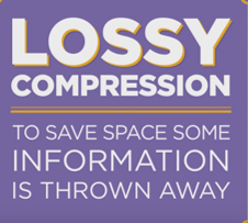
The story here is about representing increasingly complex data and information as an entree to manipulating data and information in the next chapter. The lessons are essentially a tour through some of the more interesting forms of digital information representation - specifically, images and text. Encoding images in binary can quickly explode into a number of bits that’s hard to keep in one’s head all at once. It requires structuring data that includes metadata. Compression is the art and science of how to represent the same data with fewer bits, and there are two forms: lossless compression, which allows you to reconstruct the exact original bits from the compressed version; and lossy compression, common in images and sounds, which throws out information that is likely invisible or inaudible.
The small project that concludes the chapter, Encode an Experience, is about the intersection of abstraction and data. In a nutshell, students have to think: how can I represent everything here as a series of numbers? The top-down design approach we advocate for is a useful thinking and problem-solving strategy for progressively working at finer and finer levels of detail. This approach is about understanding the spectrum of choices that are made when deciding how to represent information as data. Since so many different choices can be made, it explains the existence of so many different data formats for similar information that you encounter on a daily basis. For images you see .jpg, .gif, png. For text: .txt, .docx, .pdf, and so on. What are the differences between these things and, more importantly, why are there differences? Why can’t we just settle on a standard image format or protocol? We explore these reasons through learning experiences that allow students to try their hand at it.
The Encode an Experience project has a few underlying purposes: 1) it shows how quickly human decision-making comes into play when figuring out how to represent information; 2) the structure students come up with will look like a tree of relationships between different components of information that make up the whole - this is similar to the layers of data abstraction in database designs, and a lot of publicly-available data is often broken up this way; and 3) the “top down” approach for breaking down information is a precursor to ideas about top-down program design we address in Unit 3 - Algorithms and Programming.
Our Approach to the Content
These lessons will, in many ways, feel a lot like the information representation problems encountered in Unit 1 Chapter 1, and the approach you take should be similar - the only difference is that these lessons are strictly about information representation, rather than being about the Internet. Ultimately the choices made about how to represent information affect how you are able to process or compute with it. We encourage students to “peek” out into the real world as you go through lessons in this chapter to relate the way we encode images and compress to text to the way it’s done in the “real world”.
This chapter leans heavily on two major widgets that allow students to play with concepts. The Pixelation Widget lets students enter binary information and the widget renders an image according the embedded image format. The black and white version simply encodes images with 1 bit per pixel - 0 is black, 1 is white - while the color version requires students to understand how the RGB color scheme works and why hexadecimal representation is so useful for looking at long strings of binary values. In the widget students must also include metadata about the image (width, height, amount of color information), which mimics the “real world” uncompressed image encoding scheme known as bitmap (bmp).
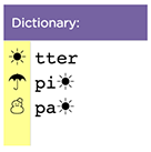
The Text Compression Widget lets students play with a text encoding/compression scheme that mimics what’s known as LZW or ZIP compression. It works by identifying repeated patterns in the original text and storing them in a “dictionary” of patterns for later recall. The challenge is to see how much students can compress an a piece of text - the catch is that there is no way to actually know what the “best” is. Compression is a type of computationally hard problem, and the best solution is to experiment, and come up a heuristic - a process that is likely to lead to a good-enough solution.